


























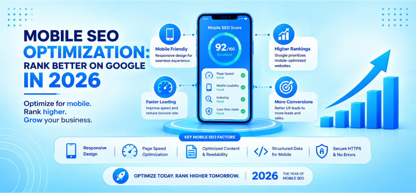
A website can look excellent on a desktop screen and still lose search visibility, leads, and sales if the mobile experience is slow, difficult to navigate, or missing important content.
That is why Mobile SEO optimization is no longer a technical extra. It is a core part of how Google crawls, indexes, and ranks websites. Google uses the smartphone version of a site for indexing and ranking, so the mobile page—not the desktop page—is the version that needs to provide the essential content, links, metadata, and structured data.
In 2026, businesses need more than a responsive layout. They need a fast, stable, accessible, conversion-friendly mobile experience that works across real devices and real network conditions. This guide explains how to optimize your site for mobile search, improve user experience, and avoid the issues that can limit rankings and revenue.
Table of Contents
- What is mobile SEO?
- Why mobile SEO matters in 2026
- Understand mobile-first indexing
- Use responsive web design
- Maintain mobile and desktop content parity
- Improve mobile page speed
- Optimize Core Web Vitals
- Make navigation easy on small screens
- Improve touch targets and forms
- Avoid intrusive pop-ups
- Optimize images, videos, and fonts
- Improve mobile content readability
- Use mobile-friendly local SEO
- Test mobile technical SEO
- Track the right mobile metrics
- Common mobile SEO mistakes
- 30-day mobile SEO plan
- FAQs
- Conclusion and CTA
What Is Mobile SEO?
Mobile SEO is the practice of improving a website so it performs well for users and search engines on smartphones and tablets.
It includes:
- Responsive web design.
- Fast loading pages.
- Mobile-first indexing readiness.
- Mobile content parity.
- Clear navigation.
- Tap-friendly buttons.
- Mobile-readable text.
- Stable layouts.
- Image and video optimization.
- Mobile technical SEO.
- Simple forms and conversion paths.
Mobile SEO does not mean building a separate mobile website by default. Google recommends responsive design, which serves the same HTML at the same URL while adapting the layout to different screen sizes with CSS.
The best mobile experience makes it easy for a visitor to understand your offer, find key information, take action, and move through the website without friction.
Why Mobile SEO Matters in 2026
Mobile search is central to how people discover products, services, locations, and answers. Customers may search on a phone while commuting, comparing providers, looking for a nearby store, reading reviews, or making a purchase.
A poor mobile experience can lead to:
- Lower engagement.
- More users leaving quickly.
- Fewer calls or form submissions.
- Lost ecommerce sales.
- Weaker local visibility.
- Missed ranking opportunities.
- Lower trust in the brand.
Google’s mobile-first indexing uses the mobile version of a page for crawling, indexing, and ranking. If your mobile version has less content, fewer links, missing structured data, or broken functionality, Google may not receive the full information available on desktop.developers.
Understand Mobile-First Indexing
Mobile-first indexing means Google primarily uses the smartphone crawler to understand your website.
This does not mean your website must be mobile-only. It means the mobile version needs to provide the core information and functionality that Google and users need.
Google’s documentation explains that responsive design uses the same HTML and URL across devices, with the layout adjusted according to screen size. This is a recommended approach because it simplifies crawling and indexing.
Mobile-first indexing checklist
- The same main content appears on mobile and desktop.
- Mobile pages use the same important title tags and meta descriptions.
- Structured data is present on the mobile version.
- Important internal links are available on mobile.
- Images use descriptive alt text on mobile.
- Canonical tags are correct.
- Mobile pages are not blocked by robots.txt.
- Mobile pages return a 200 OK status.
- Mobile users can access key functionality.
- The mobile layout does not hide critical content behind scripts or interactions.
Never assume that a visually smaller mobile layout has the same SEO value as the desktop version. Check it carefully.
Use Responsive Web Design
Responsive design allows a single page and URL to adapt to screen size. This is usually easier to maintain than separate desktop and mobile URLs.
A responsive site typically uses:
- Flexible grids.
- CSS media queries.
- Fluid images.
- Responsive typography.
- Mobile-friendly navigation.
- Scalable videos.
- Flexible spacing.
Responsive design best practices
- Use flexible widths rather than fixed desktop-only layouts.
- Test common mobile screen sizes.
- Avoid horizontal scrolling.
- Use CSS Grid or Flexbox for adaptable layouts.
- Set responsive image behavior.
- Check that pop-ups and sticky elements do not cover content.
- Test landscape and portrait orientations.
- Make sure tables can scroll or reformat on small screens.
Responsive design is recommended by Google because it serves identical HTML on a single URL, simplifying the process of crawling, indexing, and consolidating ranking signals.developers.
Maintain Mobile and Desktop Content Parity
Content parity means the mobile and desktop versions of a page should contain the same important information.
If the desktop page has a detailed service description, FAQs, product specifications, schema, reviews, and internal links—but the mobile page hides or removes them—Google may only evaluate the limited mobile content.
Check these elements
- Main page text.
- Headings.
- Title tags.
- Meta descriptions.
- Canonical tags.
- Structured data.
- Image alt text.
- Internal links.
- Product details.
- Reviews.
- FAQs.
- Contact information.
- Pricing details.
- Calls to action.
Current mobile SEO guidance recommends verifying that primary content, internal links, schema markup, alt text, and metadata remain equivalent on mobile because the mobile version is the version used for crawling, indexing, and ranking.
Improve Mobile Page Speed
Speed is one of the most important parts of the mobile user experience. Mobile visitors may be using slower networks, older devices, or limited data connections.
A page that takes too long to load may lose visitors before they see the main message or call to action.
Common causes of slow mobile pages
- Large hero images.
- Auto-playing background videos.
- Heavy JavaScript.
- Too many third-party apps.
- Excessive fonts.
- Unoptimized CSS.
- Large product-image galleries.
- Slow server response times.
- Too many tracking scripts.
- Poor caching.
- Heavy chat or pop-up tools.
Mobile speed improvements
- Compress and resize images.
- Use WebP or AVIF where appropriate.
- Serve responsive images with srcset and sizes.
- Lazy-load images below the fold.
- Avoid lazy-loading the primary hero image.
- Reduce unused CSS and JavaScript.
- Defer non-essential scripts.
- Audit third-party tags.
- Use caching and a content delivery network where appropriate.
- Improve server response times.
- Test on a real mobile connection.
Optimize Core Web Vitals
Core Web Vitals measure aspects of real user experience. They are particularly important on mobile because delays and unstable layouts create friction quickly.
| Metric | What it measures | Good target |
| Largest Contentful Paint (LCP) | How quickly the main visible content loads | 2.5 seconds or less |
| Interaction to Next Paint (INP) | How quickly the page responds to taps and interactions | 200 milliseconds or less |
| Cumulative Layout Shift (CLS) | How stable the page layout remains while loading | 0.1 or less |
These benchmarks are reflected in current 2026 mobile SEO and performance guidance.
Improve LCP
LCP is often affected by the hero image, large banner, headline block, or product image visible near the top of the page.
- Optimize the largest above-the-fold image.
- Use properly sized image files.
- Preload critical assets only when necessary.
- Improve server response time.
- Avoid blocking the main content with scripts.
- Use efficient font loading.
Improve INP
INP measures responsiveness throughout the page lifecycle.
- Reduce heavy JavaScript.
- Break long tasks into smaller tasks.
- Remove unused third-party scripts.
- Optimize filters, search, forms, menus, and product selectors.
- Test tap response on real mobile devices.
- Reduce complex animation during interaction.
Improve CLS
CLS measures unexpected layout movement.
- Add explicit width and height to images and videos.
- Reserve space for ads, embeds, and banners.
- Avoid inserting content above loaded content.
- Use stable font-loading behavior.
- Test sticky elements and pop-ups.
- Check ecommerce product pages for shifting price or stock blocks.
Make Mobile Navigation Easy
Navigation that works on a desktop can become frustrating on a phone if menus are crowded, hard to tap, or hide important pages.
Good mobile navigation should be:
- Easy to find.
- Clear to understand.
- Fast to open.
- Usable with one hand.
- Accessible with a keyboard or screen reader.
- Consistent across the website.
Mobile navigation tips
- Use descriptive labels.
- Keep main menu items limited.
- Make touch targets large enough.
- Add space between links.
- Use clear close buttons for menus.
- Keep the logo linked to the homepage.
- Make search available for large sites.
- Use breadcrumbs on deep product or service pages.
- Avoid multi-level menus that are difficult to use on touch screens.
Important conversion pages—such as services, products, pricing, locations, contact, and checkout—should not be buried behind complicated navigation.
For businesses that need a clearer, user-centered website structure, UI/UX design services focus on intuitive navigation, meaningful interactions, and visually effective digital experiences.
Improve Touch Targets and Forms
A mobile user interacts with fingers, not a precise mouse pointer. Buttons, form fields, and links must be easy to tap without errors.
Touch-friendly design checklist
- Use buttons with enough size and spacing.
- Keep touch targets away from each other.
- Avoid tiny text links for critical actions.
- Make phone numbers clickable.
- Use clear button labels.
- Provide visual feedback after taps.
- Avoid requiring hover actions.
- Test forms with the mobile keyboard.
Improve forms
- Ask for only essential information.
- Use the correct input type for phone numbers and emails.
- Show labels above fields.
- Display helpful error messages.
- Save information where appropriate.
- Avoid long multi-step forms without progress indicators.
- Put the most important fields first.
For local businesses, placing a click-to-call option and map directions near the top of the mobile page can reduce friction for high-intent users.
Avoid Intrusive Pop-Ups
Pop-ups can be useful for offers, lead magnets, cookie consent, or newsletter sign-ups. But intrusive interstitials that cover essential content can frustrate mobile users.
Avoid:
- Full-screen pop-ups immediately after landing.
- Multiple overlapping banners.
- Difficult-to-close overlays.
- Pop-ups that cover the main call to action.
- Ads or alerts that shift the layout.
- Repeated prompts after a user has dismissed them.
Use pop-ups sparingly and make sure they are easy to close. The core content should always remain accessible.
Optimize Images, Videos, and Fonts
Media can make content more engaging, but it must be optimized for mobile.
Image optimization
- Use descriptive filenames.
- Add useful alt text.
- Compress files.
- Use responsive image sizes.
- Use WebP or AVIF where supported.
- Define width and height attributes.
- Lazy-load below-the-fold images.
- Avoid oversized images in sliders.
Video optimization
- Do not autoplay heavy videos on mobile without a strong reason.
- Use poster images.
- Add captions.
- Host videos efficiently.
- Avoid placing essential information only inside a video.
- Ensure video controls are easy to use on small screens.
Font optimization
- Limit the number of font families and weights.
- Use modern font formats.
- Preload only critical fonts.
- Use fallbacks to avoid invisible text.
- Make body text readable without zooming.
Improve Mobile Content Readability
Mobile readers scan content quickly. Dense blocks of text, tiny font sizes, and long lines make reading difficult.
Mobile content tips
- Use short paragraphs.
- Use descriptive headings.
- Keep line length readable.
- Use bullet points for steps.
- Add tables only when they work on smaller screens.
- Break long guides into clear sections.
- Put the most important answer early.
- Use readable font sizes and line height.
- Avoid large walls of text.
- Keep primary calls to action visible.
Current mobile SEO guidance recommends readable body typography, practical line height, adequate spacing, and touch-friendly layouts to make content easier to use on smaller screens.
Use Mobile-Friendly Local SEO
Many local searches happen on mobile when users want directions, opening hours, phone numbers, availability, and nearby options.
For local business mobile pages, include:
- Accurate business name, address, and phone number.
- Click-to-call buttons.
- Google Maps integration where useful.
- Opening hours.
- Service-area details.
- Booking options.
- Location-specific service pages.
- Customer reviews.
- Google Business Profile links where appropriate.
- Clear directions and parking information.
A user searching for a nearby clinic, restaurant, agency, salon, or repair provider should be able to act quickly without needing to scroll through a desktop-style page.
For businesses focused on location-based growth, local SEO services include Google Business Profile optimization, local keyword targeting, location-focused content, and local search strategy.
Test Mobile Technical SEO
Do not rely on how your website looks on a desktop browser resized to a narrow window. Test the actual mobile experience and technical output.
Tools and checks
- Google Search Console URL Inspection.
- PageSpeed Insights.
- Chrome DevTools device emulation.
- Real-device testing.
- Mobile browser testing.
- Core Web Vitals reports.
- Crawl tools with mobile user-agent settings.
- Structured data testing.
- Form and checkout testing.
- Analytics segmented by device.
Check these technical elements
- Correct viewport meta tag.
- Mobile pages are crawlable.
- Mobile pages are indexable.
- Same core content on mobile and desktop.
- Same metadata on mobile and desktop.
- Same structured data on mobile and desktop.
- No horizontal scrolling.
- No blocked resources.
- No broken menus.
- No hidden critical links.
- No intrusive elements covering content.
- Mobile images load correctly.
- Forms and checkout work correctly.
Track the Right Mobile Metrics
Mobile SEO should be measured by business outcomes, not just rankings.
Track:
| Area | Useful metrics |
| Search visibility | Mobile impressions, clicks, rankings, click-through rate |
| Performance | Mobile LCP, INP, CLS, page load time |
| Engagement | Engaged sessions, scroll depth, return visitors, exit rate |
| Lead generation | Calls, form submissions, WhatsApp clicks, booking requests |
| Ecommerce | Add-to-cart rate, checkout completion, mobile revenue |
| Local SEO | Direction requests, calls, Google Business Profile actions |
Compare mobile and desktop performance. If desktop conversion is strong but mobile conversion is weak, investigate page speed, forms, navigation, content visibility, payment flow, and touch usability.
Common Mobile SEO Mistakes
Treating mobile as a smaller desktop site
A responsive layout is necessary, but mobile users have different needs and behavior. Design for their context.
Hiding key content on mobile
Do not remove important text, links, schema, reviews, or product details from mobile versions.
Using oversized media
Large images, video backgrounds, and heavy animations often hurt mobile speed.
Ignoring Core Web Vitals
Slow loading, delayed interactions, and layout shifts can harm usability and conversion performance.
Using tiny buttons and links
If users cannot tap a button easily, they may leave before converting.
Using intrusive pop-ups
Pop-ups that hide the content or are difficult to close create friction.
Forgetting mobile forms and checkout
Test the full path from landing page to purchase, booking, or enquiry on real devices.
Ignoring local conversion actions
Local mobile users often want to call, get directions, check hours, or book. Make those actions easy.
30-Day Mobile SEO Optimization Plan
1 Week : Audit mobile performance
- Review Google Search Console mobile data.
- Test priority pages in PageSpeed Insights.
- Review Core Web Vitals.
- Compare mobile and desktop content.
- Test navigation and forms.
- Identify mobile conversion drop-offs.
2 Week : Fix speed and stability
- Optimize hero images.
- Compress oversized media.
- Audit JavaScript and third-party scripts.
- Fix layout shifts.
- Improve font loading.
- Review caching and server response time.
3 Week : Improve mobile UX
- Simplify navigation.
- Improve touch targets.
- Reduce form fields.
- Make CTAs more visible.
- Fix pop-ups.
- Improve text readability.
- Test local actions such as calling and directions.
4 Week : Validate and monitor
- Test real devices.
- Validate key pages in Search Console.
- Recheck Core Web Vitals.
- Monitor mobile conversion metrics.
- Review mobile search performance.
- Create a monthly mobile SEO review process.
Frequently Asked Questions
1. What is Mobile SEO optimization?
It is the process of improving a website so it loads quickly, works properly, remains crawlable and indexable, and provides an easy experience for smartphone and tablet users.
2. Does mobile SEO affect Google rankings?
Yes. Google uses the mobile version of a website for crawling, indexing, and ranking. The mobile page should include the same important content, links, metadata, and structured data as the desktop version.
3. What is mobile-first indexing?
Mobile-first indexing means Google primarily uses a smartphone crawler and the mobile version of your website to understand, index, and rank your pages.
4. What are the Core Web Vitals targets for mobile?
Common targets are LCP of 2.5 seconds or less, INP of 200 milliseconds or less, and CLS of 0.1 or less.dynadot+2
5. Is responsive design better than a separate mobile website?
Responsive design is generally recommended because it uses the same HTML and URL across devices while adapting the layout with CSS. This simplifies crawling, indexing, and maintenance.
6. Why is my mobile traffic high but conversion rate low?
Common causes include slow speed, unclear CTAs, difficult forms, poor navigation, intrusive pop-ups, checkout friction, hidden information, or touch targets that are too small. Compare mobile and desktop behavior to find the exact drop-off.
7. How often should I audit mobile SEO?
Review mobile performance monthly, especially for high-traffic or ecommerce websites. Conduct a deeper technical audit quarterly and after major design, platform, content, or tracking changes.
Conclusion
Mobile SEO is not just about making a website fit on a smaller screen. It is about ensuring that users and search engines can access the same useful content, move through the site easily, and complete important actions without delay or frustration.
The strongest mobile sites use responsive design, maintain content parity, load quickly, meet Core Web Vitals targets, simplify navigation, improve forms, and provide visible paths to call, buy, book, or enquire.
Use this Mobile SEO optimization guide to identify weak points in your mobile experience. Small improvements to speed, stability, readability, and conversion paths can make a significant difference in rankings, user satisfaction, and revenue.
Call to Action
Need help improving mobile performance, technical SEO, search visibility, and conversion paths? Explore NP Creations AI SEO services for SEO strategy, technical optimization, content planning, and performance-focused growth support. For mobile-friendly interfaces, clearer user journeys, and conversion-focused website design, explore UI/UX design services.