


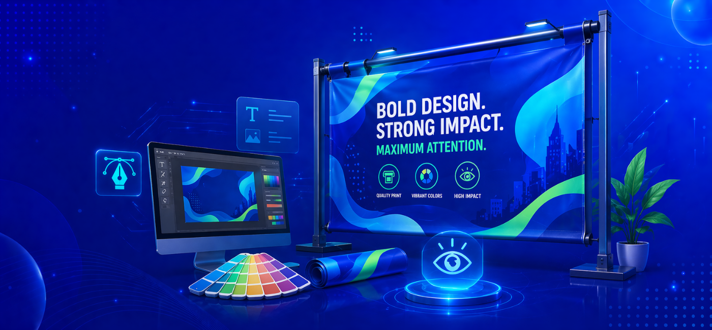
Outdoor advertising still works—and in India, it works extremely well. Whether it’s a busy market street, a highway hoarding, or a shopfront display, flex banners continue to capture attention in ways digital ads often can’t.
But there’s a catch.
Most banners fail.
They’re cluttered, hard to read, visually confusing, or simply forgettable. That’s why understanding practical flex banner design ideas India businesses can actually use is critical if you want real results from outdoor advertising.
A well-designed banner doesn’t just look good—it communicates fast, clearly, and effectively.
The Three-Second Problem
The biggest challenge in banner design is time.
A passerby has roughly three seconds—or less—to notice, understand, and react to your banner. In that short window, your design must:
- Grab attention
- Deliver the main message
- Provide a clear action
This is where most designs fail. They try to say too much, assuming the viewer has time to read everything.
Strong eye-catching banner design tips always start with simplification. The goal is not to include more information—it’s to communicate faster.
Every element on your banner should answer one question:
“Does this help the viewer understand the message quicker?”
If not, it’s unnecessary.
Hierarchy: The Most Important Design Skill for Banners
Visual hierarchy determines what people see first, second, and third.
On a flex banner, this hierarchy must be obvious—not subtle.
Your main headline or offer should dominate the design. It should be significantly larger than everything else. Supporting text should clearly come next, followed by details like contact information.
A simple test:
Blur your design or view it from a distance. If nothing stands out clearly, your hierarchy isn’t strong enough.
Among all outdoor banner design tips India businesses follow, this is one of the most important—because without hierarchy, even good content gets lost.
Typography: Where Most Banners Fail
Typography is often the weakest part of banner design.
Fancy fonts might look attractive on screen, but they don’t perform well in real-world conditions. Script fonts, thin lettering, or overly decorative styles reduce readability—especially from a distance.
For banners, readability always wins over style.
Use:
- Bold, clean fonts
- High contrast between text and background
- Adequate spacing between letters and lines
Your goal is instant recognition, not visual experimentation.
Many flex printing design trends 2026 are actually moving toward simpler typography for this exact reason—because clarity converts better than complexity.
Hindi-English Mix: Intention Over Decoration
In India, bilingual banners are extremely common—and when used well, they can significantly increase reach.
However, the mistake most designers make is giving equal importance to both languages. This creates confusion instead of clarity.
Decide:
- Which language carries the primary message
- Which one supports it
For example, your brand name might be in English, while the offer is in Hindi—or vice versa, depending on your audience.
This thoughtful use of language is becoming an important part of modern flex banner design ideas India, especially for local businesses targeting diverse audiences.
Colour Contrast for Real-World Conditions
Unlike digital screens, outdoor banners face unpredictable conditions—sunlight, shadows, dust, and fading over time.
That’s why color selection is not just about aesthetics—it’s about performance.
High-contrast combinations work best:
- Black on yellow
- White on dark blue
- Red on white
- Dark text on light backgrounds
Avoid:
- Low contrast combinations
- Overuse of gradients
- Colors that look good digitally but lose visibility in print
Many flex printing design trends 2026 emphasize bold, flat colors because they remain effective in real-world environments.
Placing the Call to Action
Your banner should not just inform—it should guide action.
Whether it’s a phone number, address, or website, the call to action (CTA) needs clear placement and strong visibility.
The most effective structure is:
- Top: Main message
- Middle: Supporting details
- Bottom: CTA
Phone numbers should be large enough to read from a distance. If someone has to slow down or zoom in to read it, the design has failed.
Among practical outdoor banner design tips India, proper CTA placement is often underestimated—but it directly impacts results.
Image Usage: One Strong Visual Beats Many Weak Ones
If your banner includes images, keep it simple.
One strong, high-quality visual creates more impact than multiple smaller ones. Too many images divide attention and reduce clarity.
Your image should:
- Show the product clearly
- Highlight the benefit or outcome
- Support the overall message
Equally important is resolution. Low-quality images look unprofessional when printed at large sizes.
This is why many modern flex banner design ideas India now prioritize clean layouts with minimal but high-impact visuals.
and Context
Not all banners serve the same purpose.
A shopfront banner, roadside hoarding, and event backdrop each have different viewing conditions. Distance, angle, and movement all affect how your design is perceived.
For example:
- A roadside banner needs larger text and fewer elements
- A shop banner can include slightly more detail
- An event banner may focus more on branding
Understanding context is essential when applying eye-catching banner design tips effectively.
Design should adapt to where and how it will be seen—not just how it looks on screen.
Consistency Builds Recognition
If you’re running multiple banners or campaigns, consistency is key.
Using the same:
- Colors
- Fonts
- Layout style
helps build recognition over time. Even if someone doesn’t read your banner fully, repeated exposure creates familiarity.
This principle is increasingly visible in flex printing design trends 2026, where brands focus on building a visual identity rather than designing each banner separately.
Common Mistakes to Avoid
Even with the right ideas, certain mistakes can reduce effectiveness:
- Overcrowding the design
- Using too many fonts or colors
- Placing important text over busy backgrounds
- Making the logo too small
- Ignoring readability from a distance
Avoiding these mistakes is just as important as following good design practices.
Final Thoughts
Flex banners are one of the most powerful tools for local advertising—but only when designed correctly.
They operate in fast-moving environments where attention is limited and competition is high. That’s why simplicity, clarity, and strong visual hierarchy matter more than anything else.
By applying practical flex banner design ideas India businesses can rely on—and combining them with proven eye-catching banner design tips—you can create banners that don’t just exist, but actually perform.
Because in outdoor advertising, the goal isn’t to impress designers.
It’s to be seen, understood, and remembered instantly.